Le Boulanger
A Refresh project. A coffee lovers dream.
Case Study
Logo
Refresh.
In updating and redesigning the Le Boulanger brand we considered a number of factors. Those included current brand equity, design strengths, and most importantly the family tradition. History was the key component to how we progressed and modernized the logo direction.
In our presentation, we provided a distinct design direction that tapped into the past and moved the brand forward without losing its history & identity.
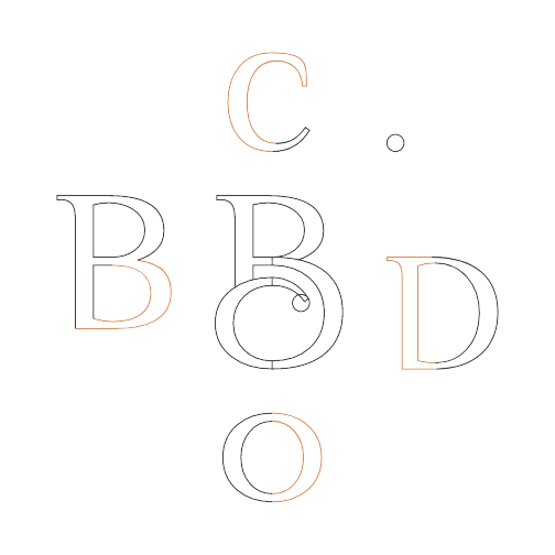
To begin the new logo process we needed to breakdown the original logo and find the baseline to create. Here's what we found.
The Typographic Solution.
The choice of the base typology for the brand is due to the following values associated with this typographic family: Clarity, Elegance, Tradition, Softness, Comfort, Humanity, Taste, Firmness, Quality, and Guarantee.
Customizing the Font. Le Boulanger"s current logo has strong typography, and what makes it stand out, even more, is the decorative ending of the letter “B“, which is also the first character of the main word, Boulanger.
Given that it is such an important feature in the current logo, we went out of our way to make the “B“ in the Philosopher font stand out as much as it did on the earlier logo, as well as the final “r“ having the same “dot“ termination.

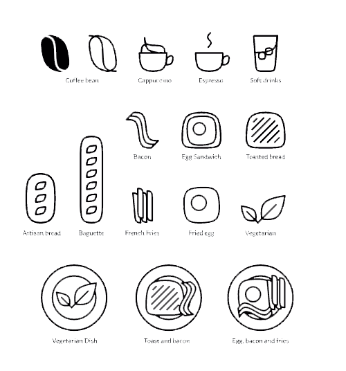
The Icon Family.
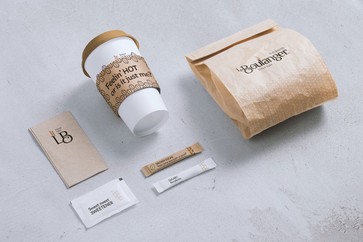
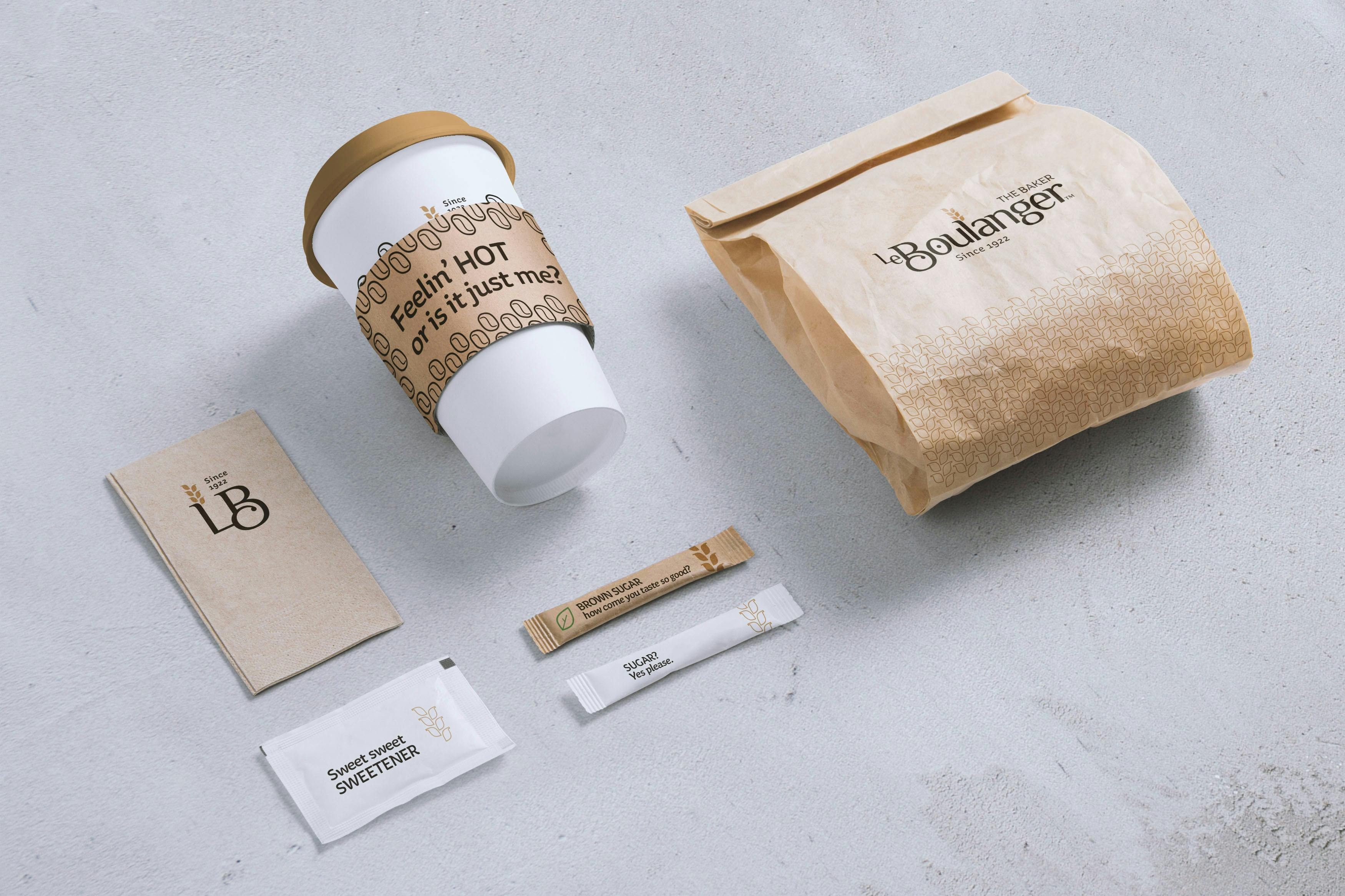
The supporting icon family was also created using the same curve. Every icon needed for Le Boulanger can be created using this same curve as a base for its elements.
It can be used in signage, packaging, gifts, napkins, whatever is needed.
They can even become a pattern for some materials.

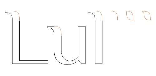
The Wheat Symbol.
The wheat symbol was created using a curve that is repeated throughout most of the Philosopher font"s characters.
Inside the logo, it can be located on the top of the letters “L”, “u”, and “l”.
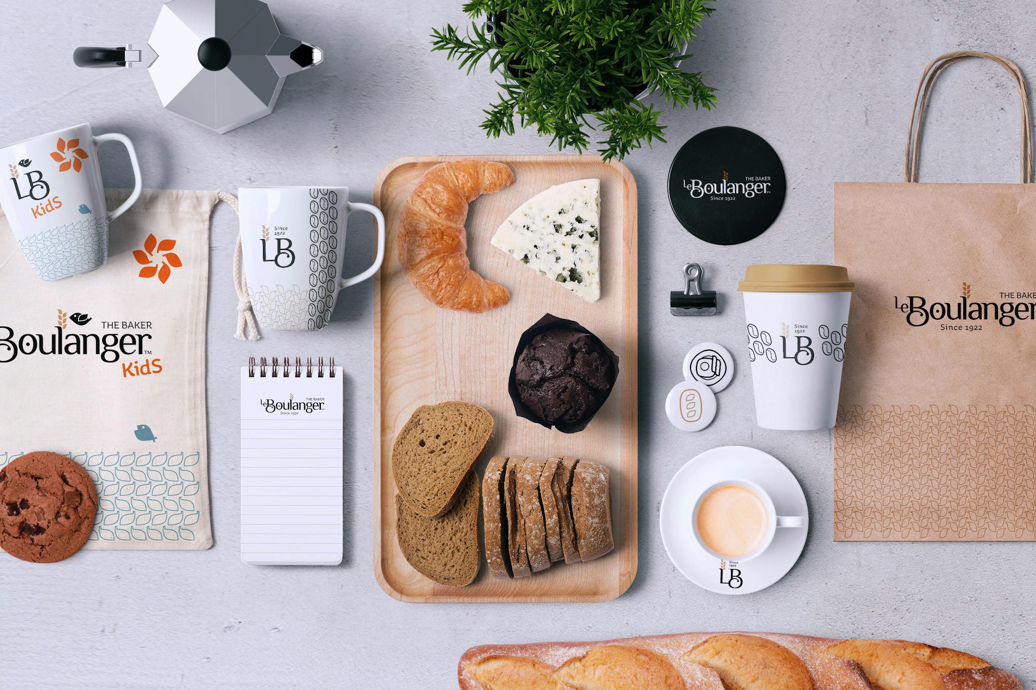
The Kids" Icons.
For use with the brand on materials for the clients" kids to enjoy while the whole family is having a great time at Le Boulanger.
These icons use the wheat icon’s grains as a base design.