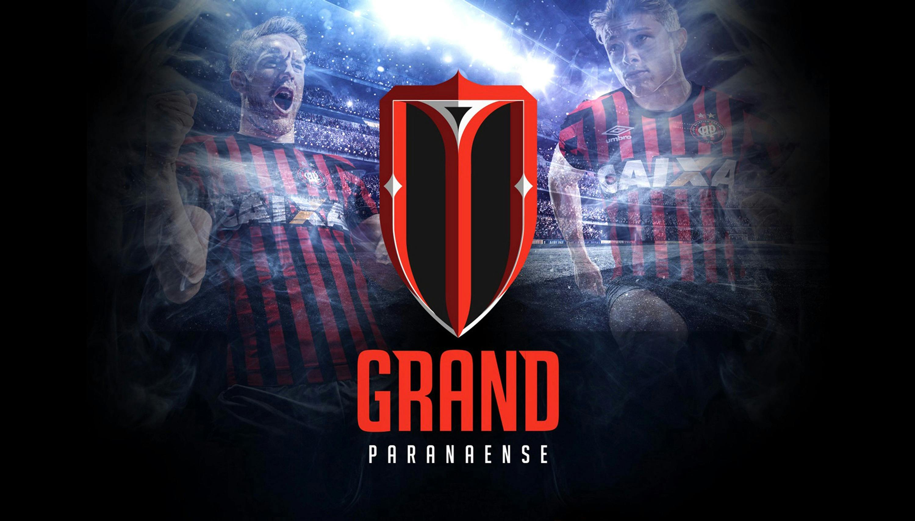
Grand Paranaense
We are Great
Case Study
Logo
We are Great.
In December 2018, the presentation of the new Visual Identity of Atlético Paranaense Soccer Club — a team of the first division of the Brazilian Championship and champion of the 2018 South American Cup — took place in the city of Curitiba, Brazil.
Copa Design — a US design agency with Brazilian roots — received an invitation in January 2017 to participate in a competition with two of Brazil’s largest design and strategy agencies. Unlike most soccer clubs in the world, the purpose of this change was to completely redesign the emblem and Visual Identity, which also included creating a new name and club mascot.
The opportunity came through one of our major clients in Brazil, CSM, a sports and entertainment marketing division of the Chime Communications Group, one of the largest communications companies in the world.
Elegance.
Our Creative Director, Leo Bandeira, acted as an account executive, directly negotiating the terms of our participation with both CSM and Atlético Paranaense’s directors.
The case of reference for this general transformation came from Juventus de Turin, an Italian soccer club which completely innovated its emblem in the same period on a project byInterbrand.
Copa had two months to present a new logo, name, uniform, mascot, voice brand and creative concept for the launch campaign, and although our proposal was not approved by the Atletico Paranaense board, this project gave us the opportunity to delve deep into the world of soccer and to better understand the relationship driven by the passion of the fans for their team at heart.
Before and After
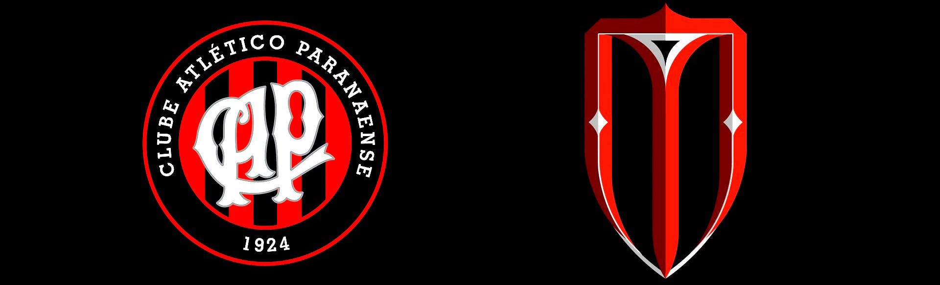
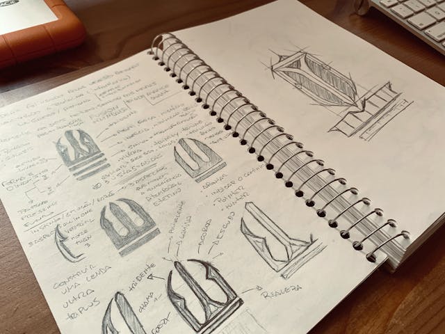
Simplifying the Shape.
Accompanying development does not mean giving up tradition. The most important value passed down from generation to generation is respect for the history of those who have built a legacy.
But new traditions are created all the time, just as history can be rewritten in seconds. However, the understanding of this inheritance will only be recognized in a future instant. Change is necessary for the propagation of ideas and the immortalization of their main characters. Thus, myths and legends are born.
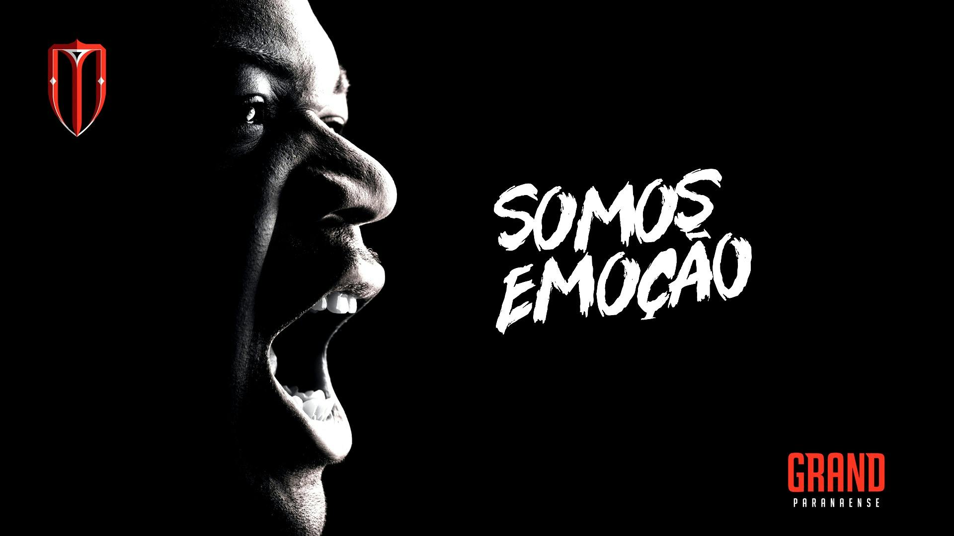
Soccer is one of those instances where Passion overcomes Results.
Simplifying the Shape.
Results are important and guarantee the good functioning of the system, but the main fuel for the development of this market are the emotions. We created a symbol that inspires inspiration and strengthens an ideology capable of enhancing feelings, thus increasing demand and generating new ways.
The complete visual redesign of a traditional club likeAtlético Paranaense requires responsibility, dedication, passion, and commitment. Having the fans by our side will facilitate the adoption process, which should be planned in the medium and long term.
In such an important moment, the engagement of the supporter will be fundamental to the success of marketing, commercial and institutional actions.
A Multi-use Brand.
The versatility of a brand makes it universal and timeless. It must be easily remembered, adapting in different segments and situations, broadening its acceptance in the most diverse market niches.
Our proposal offers strength without arrogance. Determination without aggression. Self-esteem without pride. Passion without egotism. It carries an aura of invincibility even in times of adversity.
The human subconscious recognizes symbols and associates this stimulus with a memory (remote or recent) and, consequently, with an emotion. When we remember the talent of Michael Jordan, the brilliance of Pelé, or the mastery of Muhammad Ali, we associate their images with conquests and victories.
Brands such as Apple, Nike, and Harley-Davidson are leaders in their markets not because they sell good products but because they lead people to believe in their ideals.
A Multi-use Brand.
Evolution
Renovation
Transformation
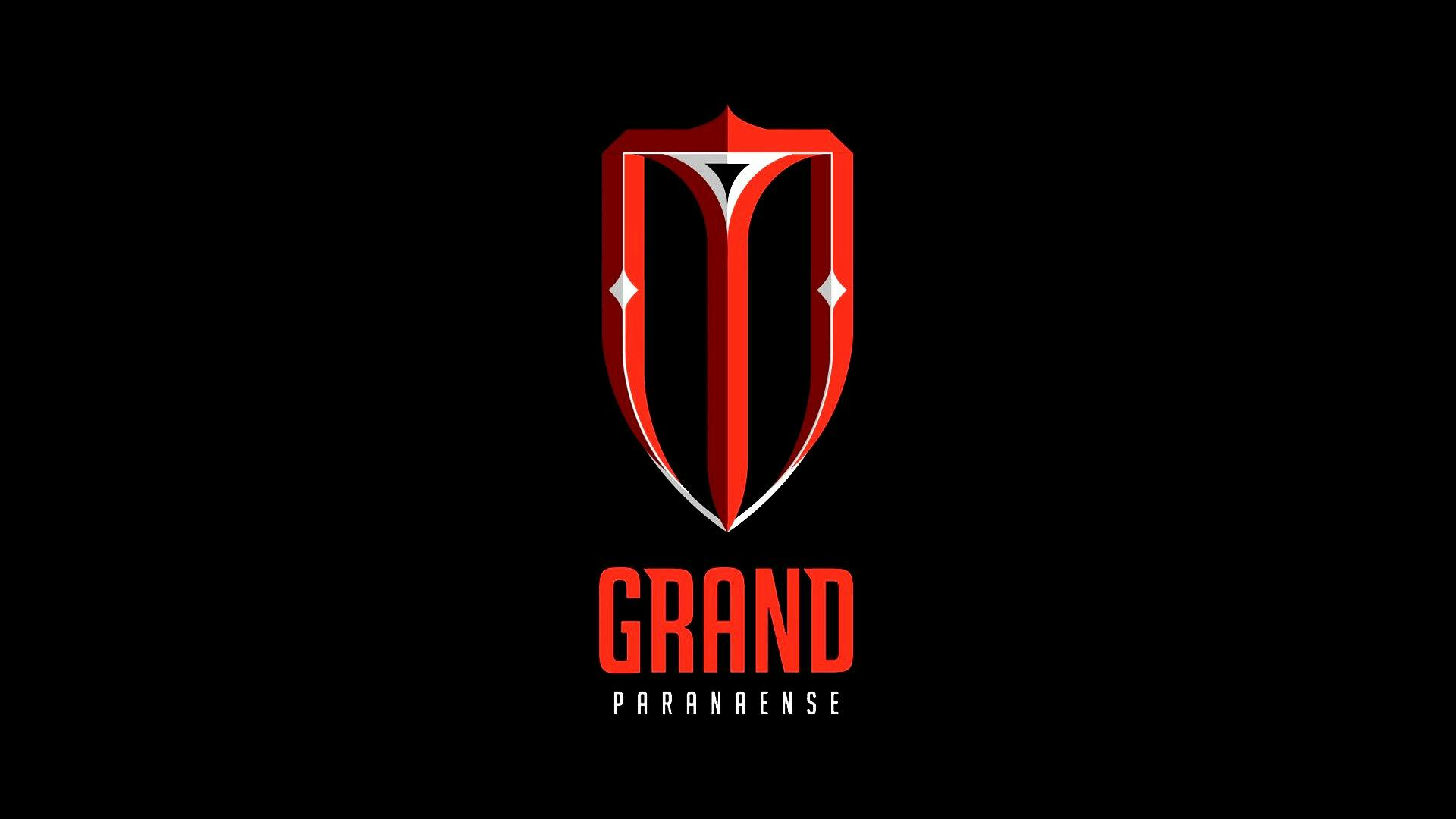
Copa’s Final Proposal for the New Logo
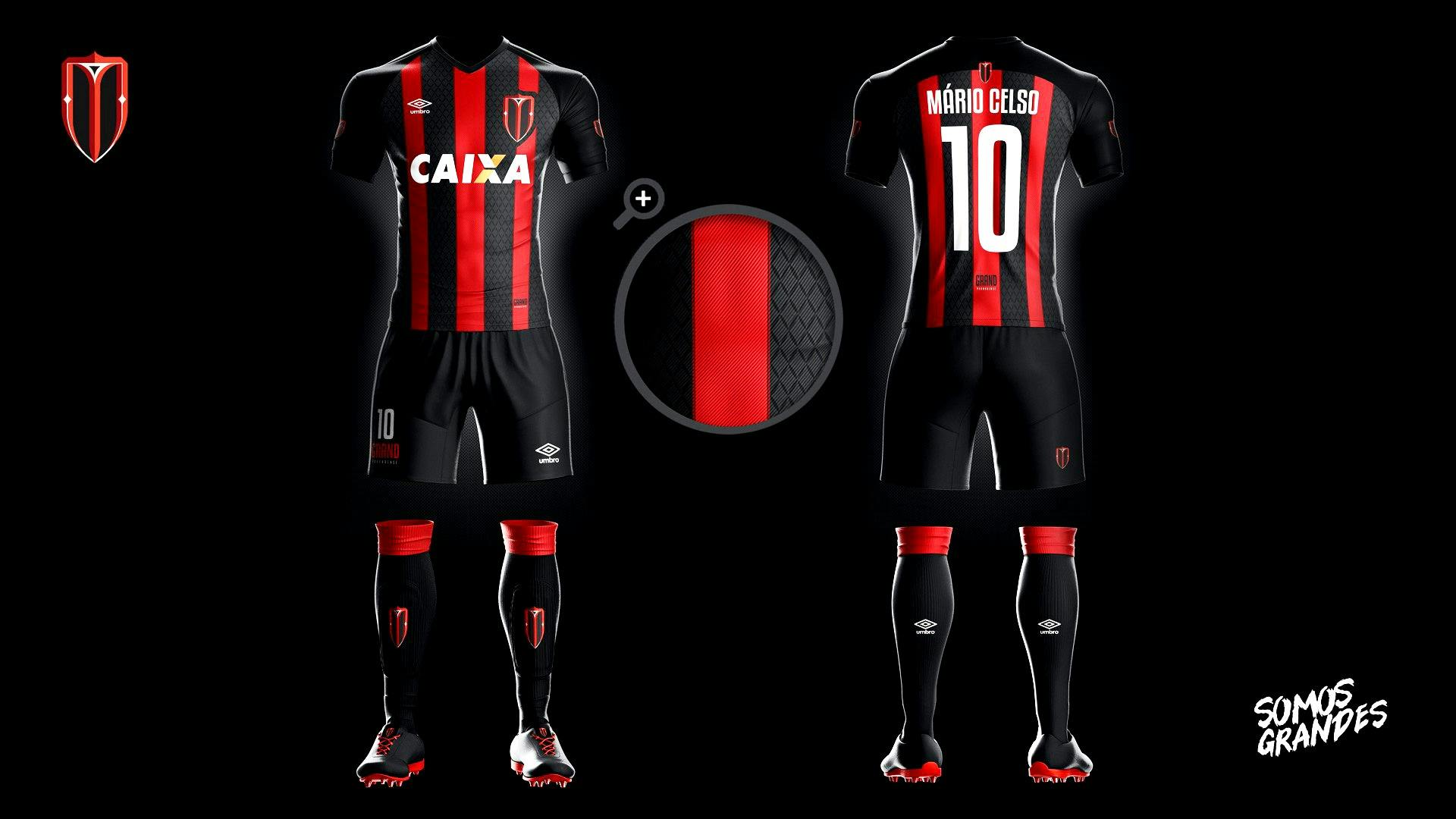
The Uniform.
Simplicity is the name of Quality
Every detail is important and should be valued as a piece of good taste and sophistication. Our main uniform proposal brings the predominance of black color.
For the jersey, we used only 3 vertical bands in red, besides the darker detail in the edges, giving greater volume and finish. The central band is slightly thicker, to give perspective and movement. The background still brings an almost transparent pattern in the diamond format, reinforcing the graphic elements of the shield.
The Uniform.
Simplicity is the name of Quality
On the shorts, we recommended using the player’s number, in addition to the new name of the ‘GRAND PARANAENSE’ club, to strengthen the idea of the change in people’s minds. And on the back, we left only the detail of the emblem.
On the socks, a horizontal red stripe creates a layer that is attractive and distinct from the rest of the black uniform. Here, too, we have created another opportunity to expose the new brand.
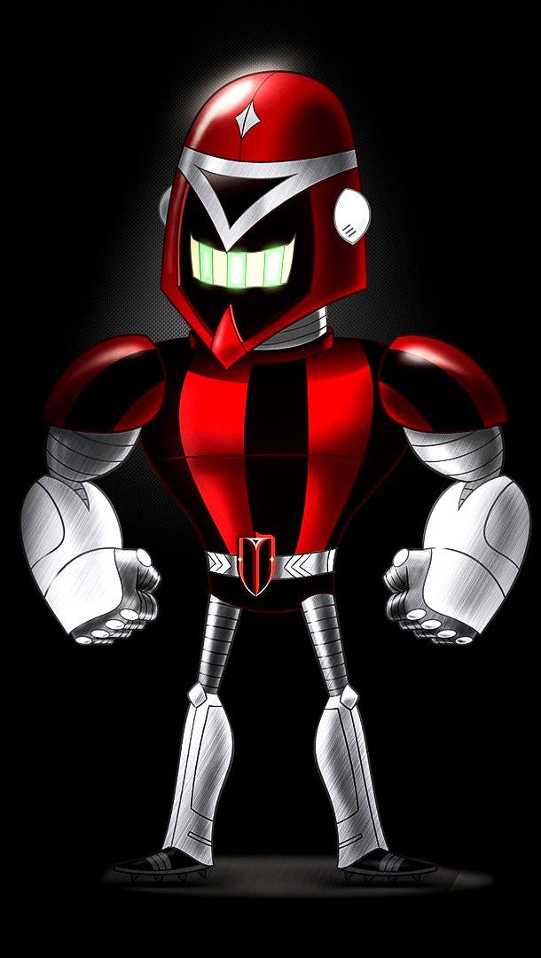
The Maskot.
Our proposal is based on technology and the future. As a result, the best mascot to represent this innovative concept is a gladiator robot.
Strong. Vigorous. Technological. Charismatic. Modern. Interactive.
We think about the synergy between him, children, young people and adults. The challenge was not to infantilize the character and still create interest and commercial appendage.
We’ll use the mascot to be a kind of ‘spokesperson’ for the club. A persona present in actions of marketing, in the games and responsible for the promotion of the new Grand Paranaense.
Art by Bernardo Prata