Wellness,
Performance
& Fertility
Case Study
Logo
Branding
Health.
The proposal of the new brand Torus Underwear is to revolutionize the men's underwear market.
And it was with this challenge that the partners sought Copa. They had a great anatomically functional idea that was conceived through a personal fertility drama and along the way discovered that tight underwear can lower testosterone levels causing difficulty in having kids.
With that in mind, our mission was beyond creating an attractive and conceptual logo and visual identity. We would need to bring together some coherent attributes that could strengthen this spirit of collaboration and social responsibility. And this is precisely what we did.
Health
After our first meeting, we already knew which visual and strategic path to follow.
We started with the brand attributes that we believed to be the most suitable: Force. Energy. Performance.
And also, the consumer profile: Bold. Healthy. Elegant.
Initially, we wanted to arouse consumers' curiosity about an underexplored topic. After attracting their attention, we would have the chance to spread the brand's values and the credibility of the product, as well as encourage new habits in their lives.

Character T


Torus | Testosterone | Tim & Tarles (Name of partners)
Bull
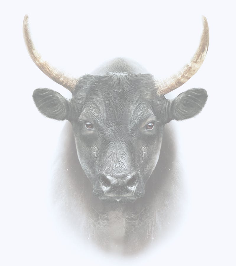
Masculinity | Virility | Reproduction
Anatomy
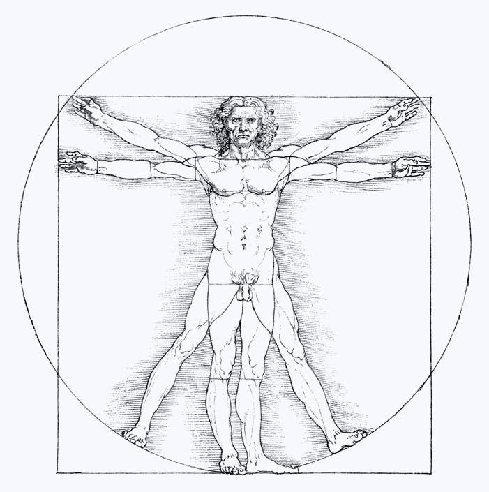
The Vitruvian Man by Leonardo da Vinci
Torus

The Universal Energy
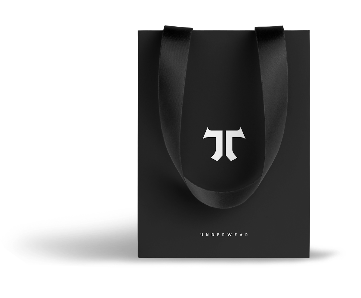
Underwear
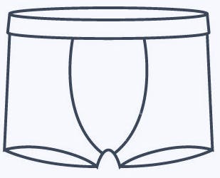
Comfort and Elegance
Pi

Well, maybe that symbolism could have been just a trip.
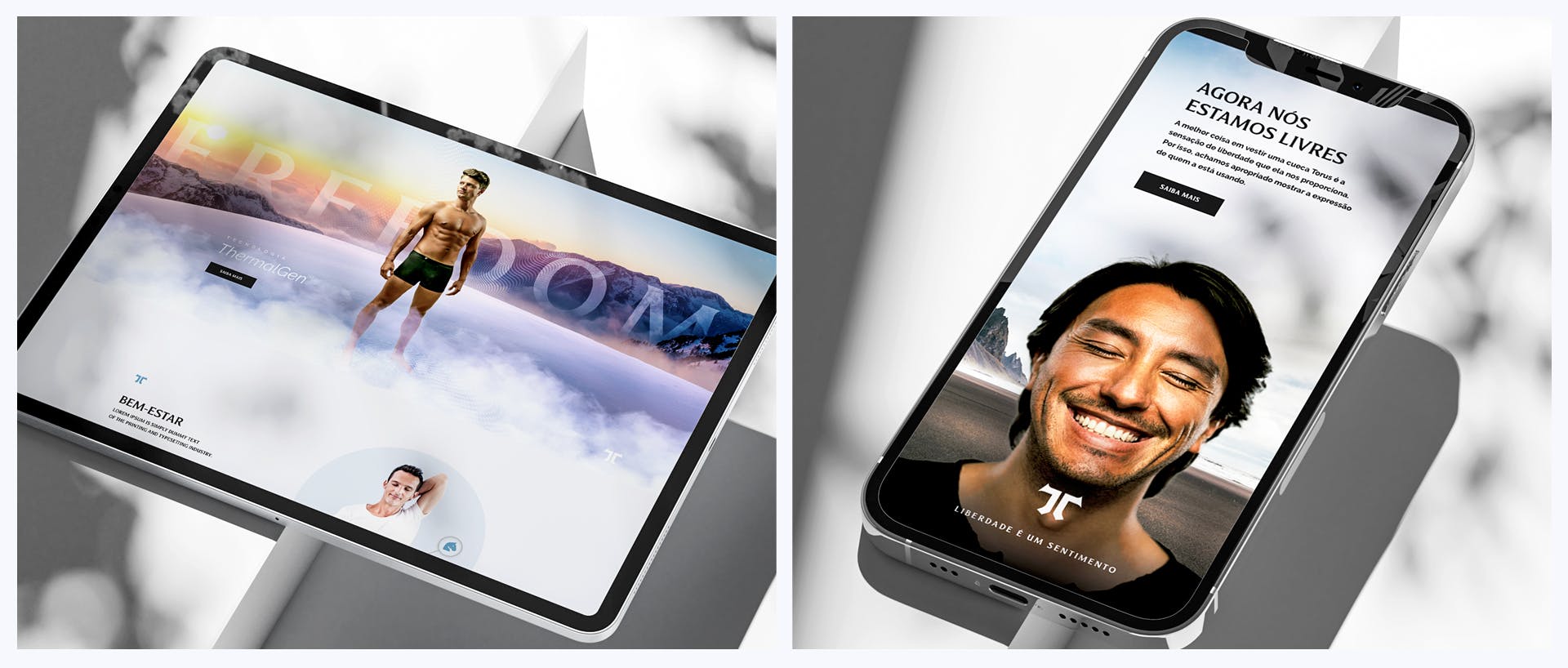
Freedom.
This slogan represents the Torus Brand Voice, the beliefs, and responsibility as members of society that seeks a better quality of life for everyone.
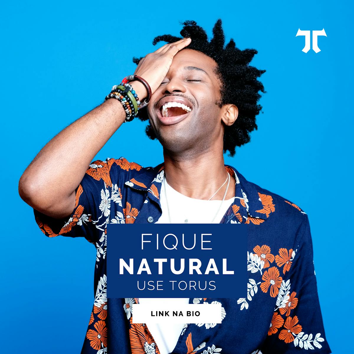
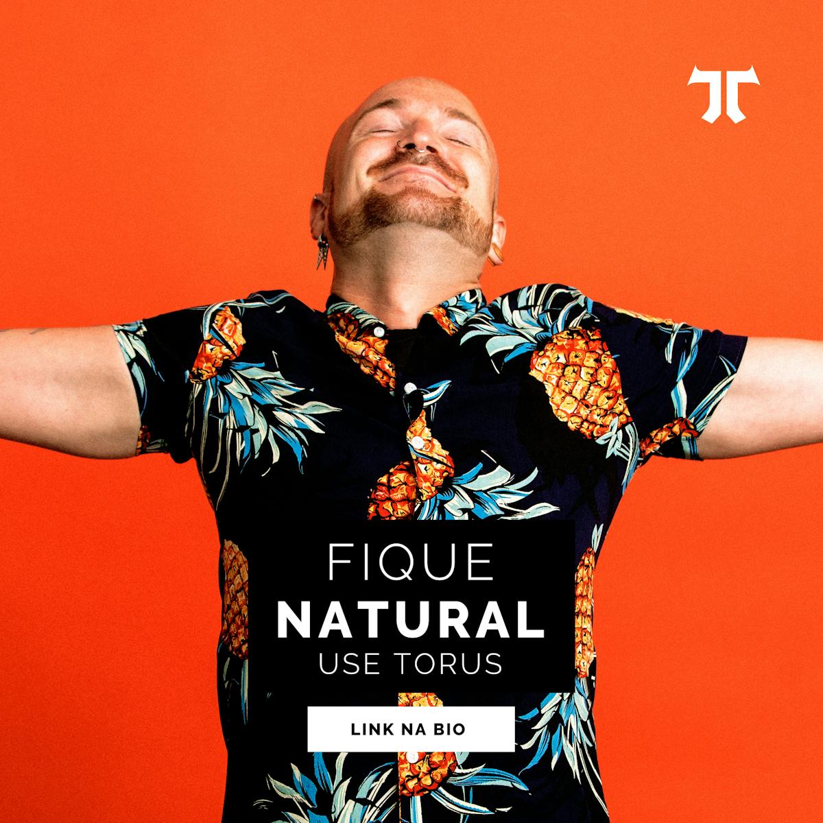
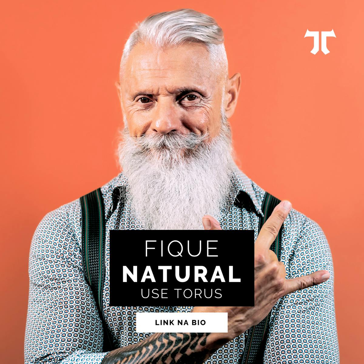
The vast majority of underwear brands focus their communication on the product. We decided to do it differently. We understand that underwear is intimate and that most of the time it is not exposed in public. So, our creative team decided to innovate and present a communication focused on the physiognomy of those who are using a Torus.
Brand Voice.
Copa also helped Torus with the construction of a Brand Book that would offer the company values and attributes consistent with its purpose and visual identity.
Coherence between the visual identity, as well as its communication, and the Spirit of the Torus Brand. Respect and obey the brand's purpose for the world and for people, not the product it sells.Copa believes that this is what keeps brands alive and relevant over the decades.
We understand thatTorus doesn't just sell underwear. It absorbs, understands, offers, and transmits the true purpose of man, in terms of health, reproduction, and vital energy, directly reflecting on his comfort, well-being, and self-esteem.
Brand Voice.
Our objective with this document was to show that the values, qualities, messages, aspirations, and attractions of the brand were understood with just a single look.
When we created the design project, we knew we had to go further and show everyone that it wasn"t “just“ a logo, it was the reason why Torus exists.
TONE OF VOICE FROM TORUS UNDERWEAR:
- Human
- Smart
- Inspiring
- Visionary
- Atractive
- Daring
Icons.
Cool Wave
Thermals
Breathability
Energy
Bactery Free
Fabric Tech
Fertility
Made in Brazil
Performance
Moisture Control
Protection
Wellness
Confort